Convert the visit
What a dentist's website needs that a plumber's doesn't
Three kinds of decision, three different pages — and why a template built for one trade quietly fails another.
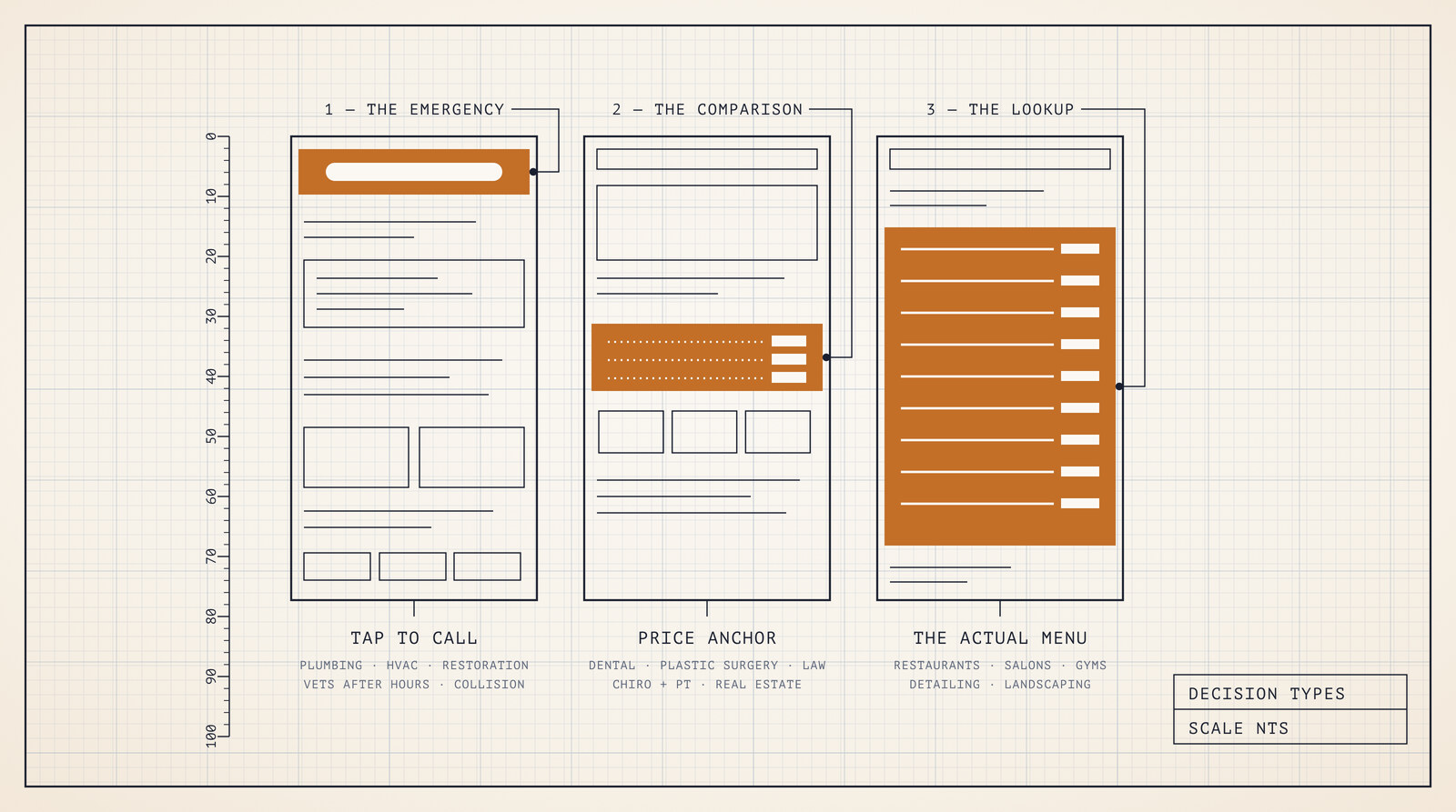
Every local business gets sold the same website. A hero image, an about section, a grid of services, a contact form at the bottom. The colours change by industry. Nothing else does.
That is backwards, and it is the most expensive ordinary mistake in this trade. What decides whether a site books work is not what you sell — it is the decision the visitor is in the middle of making when they land. There are only three of those, and they want three genuinely different pages.
1. The emergency decision
A pipe burst twenty minutes ago. The van won't start. There is water coming through a ceiling, or a dog that has eaten something it shouldn't have, at eleven at night.
The visitor is standing up, on a phone, with one hand free. They will decide in well under a minute and they are not reading — they are scanning for evidence that you are real, close, and answering. Every second the page spends introducing itself is a second the next result in the list is being tapped instead.
So the page is mostly one thing: a way to reach you, present before anything else and never scrolling away. Around it goes the small amount of information that a frightened person actually needs — are you open now, how fast do you come, do you handle this specific thing, what should they do in the meantime. That last one matters more than it looks. A restoration company that tells someone where their shut-off valve is has already behaved like the company you'd hire.
What comes out: the slideshow, the founder's story, the gallery, the values. Not because they're bad, but because on this page they are competing with the phone number and losing you the job. This is the shape we build for plumbers, HVAC contractors and electrical contractors, and it is why those pages look almost aggressively plain.
The test: if the visitor's thumb never leaves the bottom third of the screen, do they still get everything they need to call you?
2. The comparison decision
Nobody wakes up needing a crown at 2 p.m. the way they need a plumber at 2 a.m. Implants, rhinoplasty, a family law matter, a course of physical therapy, listing a house — these get thought about for days, discussed with someone, and compared across three to five providers before anyone picks up a phone.
That visitor arrives calm, sceptical and price-anxious. And here is the part most practices get wrong: they will not call you to ask what it costs. They will read your site, fail to find a number, decide you are the expensive one, and go and read someone else's. Refusing to publish a range doesn't protect your pricing. It just moves the decision somewhere you can't influence it.
The page's job is to be knowable. A real number or an honest range on the procedures people actually shop — that is two or three of them, not your whole fee schedule. A page per procedure, because "cosmetic dentistry" is not what anyone types. Credentials where they can be checked. And, for the regulated trades, the disclaimers written into the layout rather than remembered afterwards, which is why the law firm structure puts prior-results language beside the results instead of in a footer nobody reads.
It is the same skeleton behind dental practices, plastic surgery, chiropractic and PT clinics and real estate. What comes out here is urgency. A countdown on a decision someone is going to take two weeks over reads as a warning sign, not an incentive.
The test: can a stranger work out roughly what this costs and roughly what happens, without contacting you?
3. The lookup decision
The third kind of visitor has already half-decided about you. They are not weighing you against anyone. They want one fact: what's on the menu tonight, what a men's cut costs, whether there's a class before work, whether you do ceramic coating, whether you'll take on a garden that size.
This is the easiest decision to win and the one most often thrown away, because the fact exists and the site has hidden it. A menu in a PDF. A price list photographed on a chalkboard. A timetable that says "call for details". The business knows the answer and has published an image of the answer, which is not the same thing.
If the answer is in a picture, it does not exist — not to a search engine, not to an AI assistant summarising your business to someone who asked, and not to a person on a bus with the brightness turned down. So on these pages the information is the design: the restaurant template publishes the whole menu as real text on the home page, the salon one is built around a printed-style price list with a duration on every line, the gym one makes a live class board the hero, and the detailing one puts package tiers and proof on a single page because the decision is short.
The test: can someone find the specific fact they came for in under ten seconds, as selectable text, without contacting you or downloading anything?
The failure is always a borrowed structure
Put the wrong shape under a business and you can watch it fail in a predictable way.
Give a dental practice the emergency layout and you get a site shouting CALL NOW at someone quietly researching implants for a fortnight — loud, slightly desperate, and silent on the only question they had. Give a plumber the comparison layout and you get a beautiful pricing table being scrolled past by a person standing in water. Give a restaurant either one and you get a gorgeous site that never says what's for dinner.
None of those sites are broken. They all look fine in a screenshot. They are just answering a question nobody on that page is asking.
How to tell which one you are
Three questions, in order:
How long between the problem appearing and the money being spent? Minutes or hours means emergency. Days or weeks means comparison. If it's a thing they'll do again next month, it's lookup.
Does the customer know what they want before they arrive? If they do, your job is information. If they don't, your job is to explain and to anchor.
Would they call to ask the price — or leave? Emergency customers call. Comparison customers leave. That single difference is why one of these pages can hold a number back and the other cannot.
Some businesses are honestly two things, and it's worth saying so rather than pretending the categories are tidy. An auto body shop is an emergency at the roadside and a comparison by the time the insurer is involved. A veterinary clinic is a lookup for a wellness visit and an emergency at eleven at night. Landscaping is a lookup for maintenance and a long comparison for a design-build. Those businesses need both structures — and the thing that decides which customer you serve well is the order you put them in on the page.
What this means when you're buying
Stop asking whether a website looks good. Every template on sale looks good; that stopped being a differentiator years ago. Ask what decision it is shaped for, and whether that is the decision your customers are actually in.
That question is also the fastest way to judge a quote. Anyone can tell you they'll build you a modern, mobile-friendly, SEO-optimised website. Ask them instead what they intend to put in the first screen and what they intend to leave out, and you will learn in about a minute whether they have thought about your customers or about their portfolio.
And the honest limit: this is a page-structure argument, not a traffic one. A perfectly shaped page that nobody finds books exactly nothing, which is a different problem with a different guide. If your bookings already all arrive by text message from regulars, none of this is your bottleneck and you should spend the money elsewhere. Structure only pays once people are arriving and leaving again.
Next
Also in the Field Guide
Own your site · 8 min
What a local business website actually costs
Three routes, five years, and the arithmetic nobody shows you — including the one where we are the expensive option.
Convert the visit · 9 min
The anatomy of a page that books work
Five parts, in order, with the reasoning for each — and the four things we take out of nearly every site we rebuild.
Get found · 7 min
Being found when the search happens inside an AI
Customers are starting to ask an assistant instead of scrolling ten blue links. What that changes, and what it does not.
This, built for your trade
Every template line we sell carries the structure these guides describe — hand-written HTML you own outright from $49, with a live demo on every one. Rather not touch the files? We launch it for you.