Convert the visit
The anatomy of a page that books work
Five parts, in order, with the reasoning for each — and the four things we take out of nearly every site we rebuild.
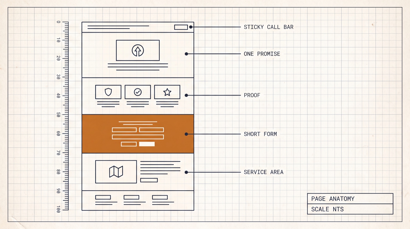
A local service page has one job. Not "represent the brand", not "showcase our work" — get the customer to make contact, on the visit they are already having. Everything on the page either serves that or competes with it.
What follows is the structure we build for paying clients, in the order it appears on the page, with the reasoning for each part. It is not a style. Five of these can be applied to a site you already own by this afternoon.
1. The sticky call bar
On mobile, a bar pinned to the bottom of the viewport with a single tap-to-call action, present on every page, never scrolling away. This is the highest-leverage element on a local site and the one most often missing.
The logic is about timing, not persuasion. A customer's willingness to call peaks at an unpredictable moment — halfway through a paragraph about your warranty, or the second they see a photo of work like theirs. If the phone number is in the header, they have scrolled past it. If it is in the footer, they have to earn it. A pinned bar means the peak is always one tap from the action.
Two details matter. It must be a real tel: link, so one tap dials rather than
selecting text. And it should say what happens next — "Call the shop" beats a bare number,
because a bare number asks the customer to decide who they are about to interrupt.
2. One promise, above the fold
One sentence saying what you do, for whom, and where. Then one button. Not a slideshow, not a mission statement, not "Welcome to our website".
The test we use is the match test: whatever brought the customer here — a Google search for "bumper repair near me", an ad about free estimates, a card handed over at a body shop — the first line they read should repeat it back to them. A visitor who searched for one thing and landed on a page about something broader assumes they are in the wrong place, and the back button is free.
This is why a page per service beats one clever page. It is also why an ad landing page should carry the ad's exact promise in its headline, and why we ship a separate navigation-free landing layout for paid traffic: on a page bought by the click, every link that is not the goal is a leak.
3. Proof that survives scrutiny
Immediately after the promise, evidence — because a promise from a stranger with money at stake is worth nothing on its own. Three kinds work, in descending order of power:
- Your own work, before and after. For trades where the outcome is visual — collision repair, landscaping, dentistry, aesthetics — this is the single most persuasive thing you own. A drag-to-compare slider on two photographs of the same job beats any adjective.
- Reviews with names and dates, quoted, not paraphrased, and matching what is publicly visible on your Google profile. A reader who can verify one review believes the rest.
- Specifics that only a real operator knows. The brands you are certified on, the insurers you work with, how long the bay is booked out. Detail is credibility.
Two obligations come with this. Get permission before publishing a customer's car, house or face — and for anything medical or identifying, blur plates, VINs and anything else that identifies a person. And never simulate a result you did not achieve: if a comparison image is illustrative rather than a real job, it has to say so on the image. Proof that turns out to be decoration does more damage than no proof at all.
4. The short form
A form with the fewest fields that still lets you quote, and a stated promise about what happens after they press the button.
Every field is a chance to stop. Name, phone, and the one thing you cannot quote without — photos for collision work, address for a service call, treatment of interest for a clinic. That is usually four or five inputs. Anything you merely like to know can be asked on the phone, when they are already talking to you.
The promise matters as much as the brevity. "We'll text you back within an hour with a window and a price range" converts differently from "Submit" — because the customer's real fear is not the form, it is being pulled into a sales process with no defined end. Tell them the shape of the next step and the form stops feeling like a trap. Then keep the promise; a stated response time you miss is worse than never stating one.
5. The service area, honestly
Where you work, named — towns, neighbourhoods, ZIPs — with real response times, and with the edges admitted. "Same-day within ten miles, next day out to the county line" is worth more than a map with a circle on it.
This does double duty. It answers the question every local customer has before they call, and it gives search engines and AI assistants the specific place names that make you the answer to "near me" — a subject we take up in the guide on AI visibility. What it must not become is a wall of two hundred town names you do not serve. Nobody is fooled, and it reads as spam to readers and ranking systems alike.
What we take out
Rebuilds are mostly subtraction. Four things come off nearly every site we touch:
- The hero carousel. Auto-rotating slides mean the customer reads whichever message happens to be showing, and the second slide is seen by almost nobody. Pick the strongest message and commit to it.
- Stock photography of people who do not work there. A smiling model in a clean shirt reads instantly as generic, and it quietly implies you had nothing real to show. A slightly imperfect photograph of your actual bay outperforms it.
- Navigation on paid landing pages. If a click cost money, the page gets one exit and it is the form.
- Unstaffed live chat. A widget that promises a person and delivers silence converts a warm visitor into an annoyed one. Either staff it — or route it to something that answers honestly and hands off.
The order is the point
Promise, proof, ask — with the phone permanently reachable. Every part above exists to move a visitor one step along that sequence, and the sequence is what makes it work rather than the styling. A plain page in the right order beats a beautiful page in the wrong one.
All ten of our template lines are this structure, built out for a specific trade. If you would rather see it than read about it, every product page carries a live demo you can click through at desktop and phone size before spending anything — and the cost guide covers what each route to getting there is worth over five years.
Next
Also in the Field Guide
Own your site · 8 min
What a local business website actually costs
Three routes, five years, and the arithmetic nobody shows you — including the one where we are the expensive option.
Convert the visit · 9 min
What a dentist's website needs that a plumber's doesn't
Three kinds of decision, three different pages — and why a template built for one trade quietly fails another.
Get found · 7 min
Being found when the search happens inside an AI
Customers are starting to ask an assistant instead of scrolling ten blue links. What that changes, and what it does not.
This, built for your trade
Every template line we sell carries the structure these guides describe — hand-written HTML you own outright from $49, with a live demo on every one. Rather not touch the files? We launch it for you.